DESIGN: Herzog & de Meuron
LOCATION: Weil am Rhein, Germany
DATE: 2010
PHOTO: Iwan Baan
PROJECT DESCRIPTION:
Over the years the Vitra Campus has become an architecture museum, featuring works by the most renowned architects: Frank Gehry, Zaha Hadid, Alvaro Siza, Tadao Ando, Jean Prouvé, Nicholas Grimshaw, Buckminster Fuller and SANAA (under construction). The latest addition to the complex is the VitraHaus building, a series of stacked pitched-roof boxed, designed by Herzog & de Meuron for Vitra’s Home Collection:
In January 2004, Vitra launched its Home Collection, which includes design classics as well as re-editions and products by contemporary designers. As a company whose previous activity was primarily focused on office furnishings and business clients, Vitra created the Home Collection with a new target group in mind: individual customers with an interest in design.
Since no interior space was available for the presentation of the Home Collection on the Vitra Campus in Weil am Rhein, the company commissioned Basel-based architects Herzog & de Meuron in 2006 to design the VitraHaus. Thanks to its exposed location and striking appearance, it not only enhances the already outstanding ensemble of Vitra architecture, but assumes the important role of marking the Vitra Campus. Standing on the northern side of the grounds in front of the fenced perimeter of the production premises, the VitraHaus joins two other buildings in this area, the Vitra Design Museum by Frank Gehry (1989) and the Conference Pavilion by Tadao Ando (1993). The ample size of the plot made it possible to position the new structure a good distance away from the Vitra Design Museum and adjacent gatehouse, making room for an extension of the orchard meadow in front of the buildings, a typical feature of the local landscape.
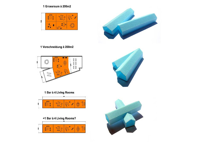
The concept of the VitraHaus connects two themes that appear repeatedly in the oeuvre of Herzog & de Meuron: the theme of the archetypal house and the theme of stacked volumes. In Weil am Rhein, it was especially appropriate to return to the idea of the ur-house, since the primary purpose of the five-storey building is to present furnishings and objects for the home. Due to the proportions and dimensions of the interior spaces – the architects use the term ‘domestic scale’ – the showrooms are reminiscent of familiar residential settings. The individual ‘houses’, which have the general characteristics of a display space, are conceived as abstract elements. With just a few exceptions, only the gable ends are glazed, and the structural volumes seem to have been shaped with an extrusion press. Stacked into a total of five stories and breathtakingly cantilevered up to 49 feet in some places, the twelve houses, whose floor slabs intersect the underlying gables, create a three-dimensional assemblage – a pile of houses that, at first glance, has an almost chaotic appearance.
The charcoal color of the exterior stucco skin unifies the structure, ‘earths’ it and connects it to the surrounding landscape. Like a small, vertically layered city, the VitraHaus functions as an entryway to the Campus. A wooden plank floor defines an open central area, around which five buildings are grouped: a conference area, an exhibition space for the chair collection of the Vitra Design Museum and a conglomerate comprising the Vitra Design Museum Shop, the lobby with a reception area and cloakroom, and a café with an outdoor terrace for summer use. A lift takes visitors to the fourth storey, where the circular tour begins. Upon exiting the lift, the glazed northern end of the room offers a spectacular view of the Tüllinger Hill. The opposite end – where the glass front is recessed to create an exterior terrace – opens to a panorama of Basel with the industrial facilities of the pharmaceutical sector. As one discovers on the path through the VitraHaus, the directional orientation of the houses is hardly arbitrary, but is determined by the views of the surrounding landscape.
The complexity of the interior space arises not only from the angular intersection of the individual houses but also from the integration of a second geometrical concept. All of the staircases are integrated into expansive, winding organic volumes that figuratively eat their way through the various levels of the building like a worm, sometimes revealing fascinating visual relationships between the various houses, at other times blocking the view. The interior walls are finished in white in order to give priority to the furniture displays.
CLICK ON THE IMAGES BELOW TO ENLARGE:
LOCATE THIS PROJECT IN GOOGLE MAPS:
READ MORE ABOUT THIS PROJECT AND/OR ARCHITECT:


No comments:
Post a Comment